
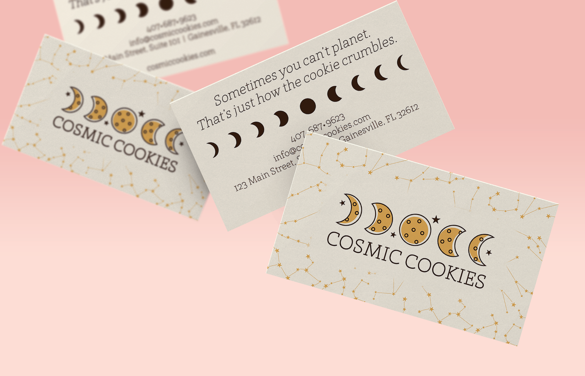
CREATIVE DIRECTION • GRAPHIC DESIGN
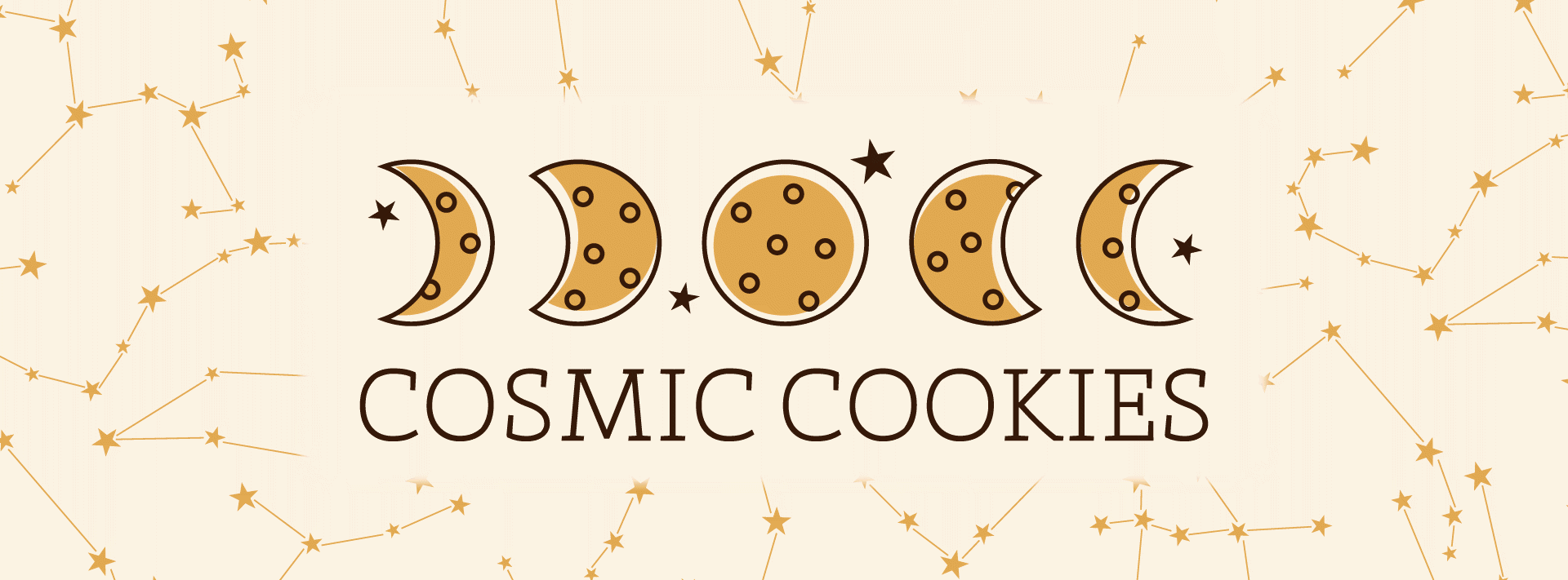
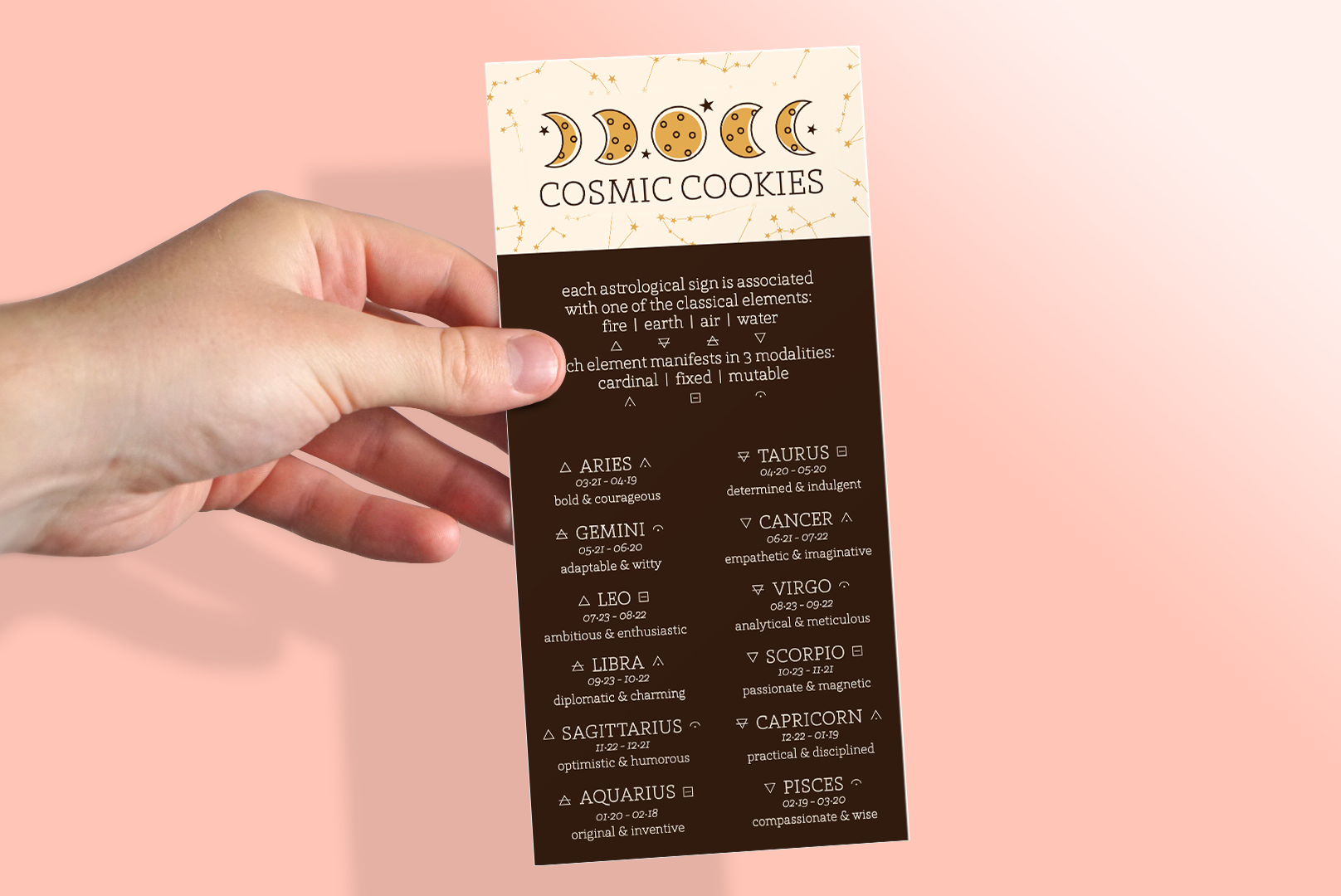
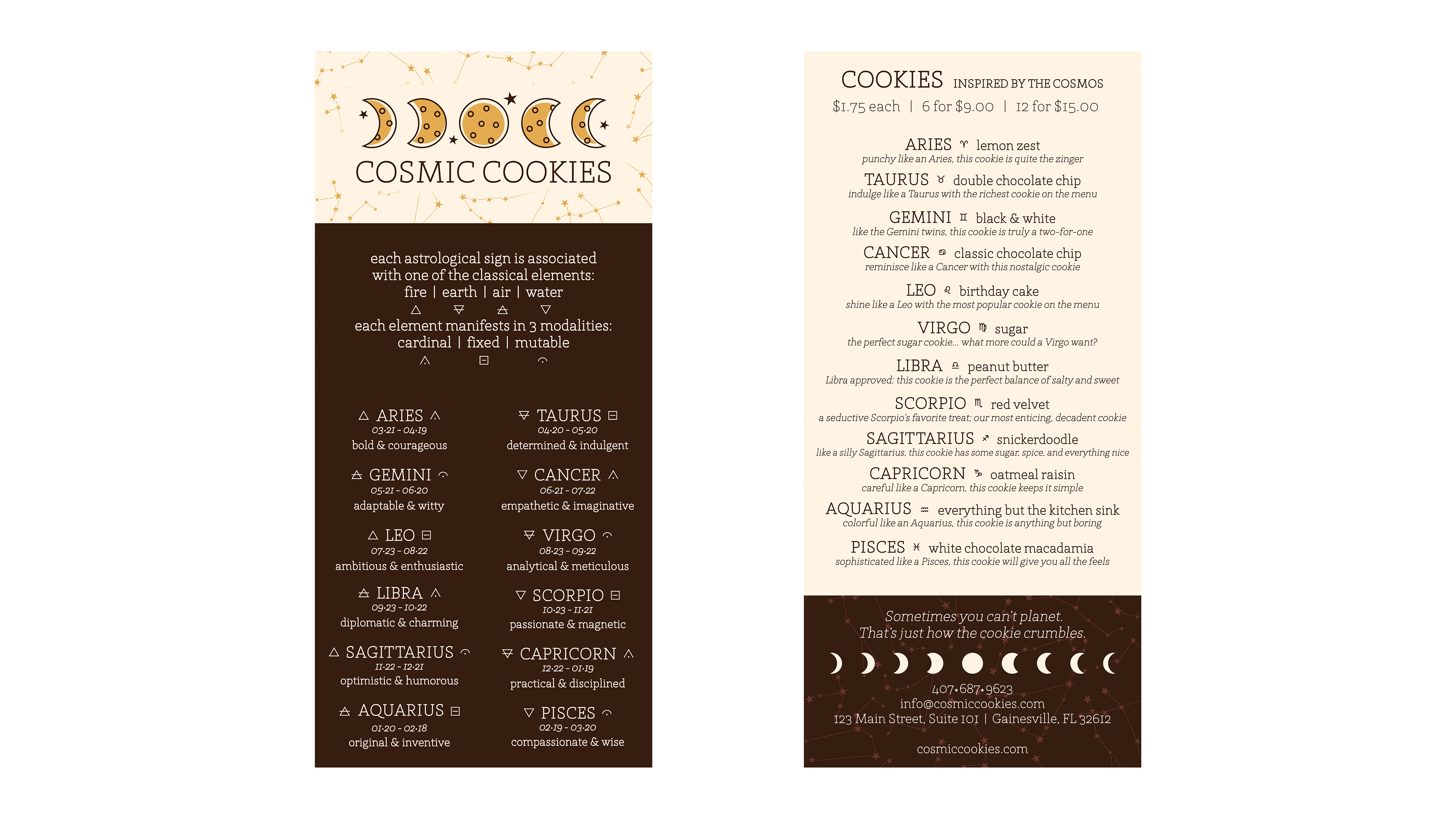
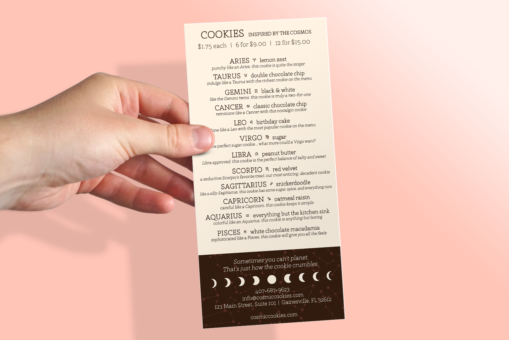
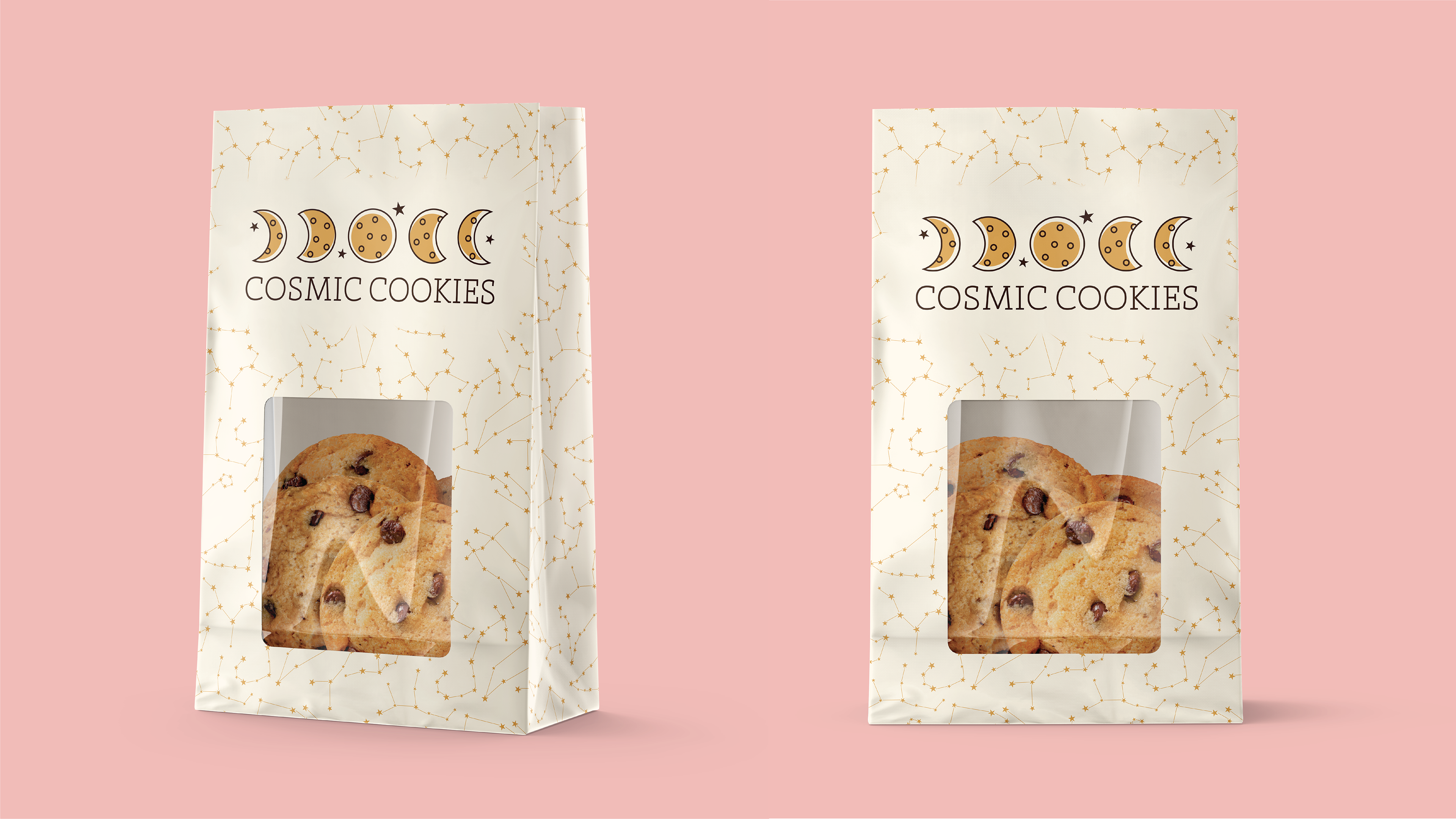
This project combines two of my passions: cookies and astrology. I created a fictional brand from the ground up, designing the logo, menus, and copy to explore the full branding process. The logo reflects the phases of the moon while subtly evoking chocolate chip cookies, and the overall brand aesthetic is warm and inviting. Each cookie is paired with a unique astrological sign, tying the product to a playful, personalized experience.
Sometimes you can't planet. That's just how the cookie crumbles.
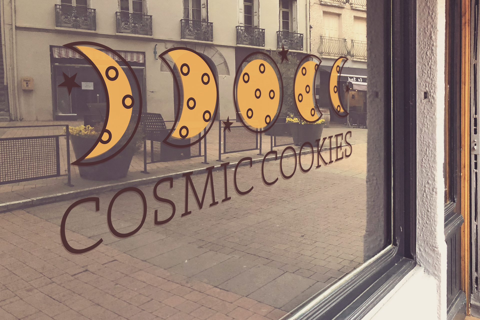


Both photographs are from iStock.com.